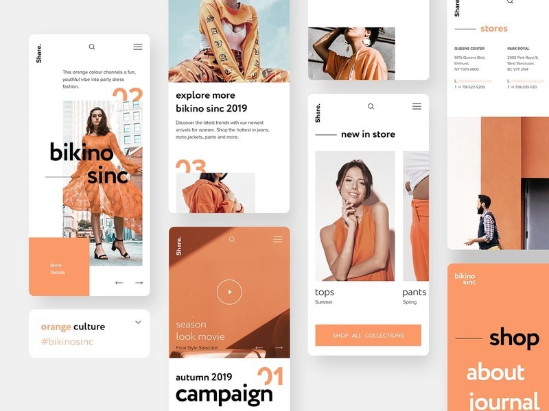
If there is one way you can have your e-commerce website impact a visitor, its design.
The website design directly affects the amount of time a user will spend on the domain and how much they are likely to purchase.
It doesn’t take long for a person to decide if they should stay and browse further. From the user interface (UI) to user experience (UX), e-commerce retailing is not just about how the website looks but how it works.
The Upscaling Design: a Trend
According to a recent market study, only 64% of US small-scale businesses have a website.
However, as the online domain grows, more companies realize the importance of having a freshly designed user interface. The current COVID-19 pandemic has only intensified the situation as people have, either reluctantly or willingly, moved towards online transactions, and business owners cannot ignore facts any longer.
To make e-commerce websites that sell, let’s look into the eight redesign tips and practices that you can incorporate for impeccable user experience.
- It is in the Rebranding/Branding
Rebranding should not be limited to designing a new website logo. The significant revamp is about communicating effectively with the audience and making them stay or revisit.
The tone of voice should also be kept in mind while making a website copy by adding FAQs and online customer service.
Branding is how a business wants to be seen in the market, so the scope of website design mainly depends on how much the company is willing to change. For instance, an immigration consultancy whose consumers face travel issues would benefit from a rebrand that portrays them as more reliable.
It does not matter whether you are making amendments to an existing idea of creating a new one entirely. Here are some of the things that you need to consider while working on your product:
- Is the landing page captivating?
- Do the colors grab attention?
- Does the overall aesthetic attract viewers?
- Are the FAQs helpful?
- Is the customer service responsive enough?
- Does the website need any add-ons like a live chat?
Last but not least, look into consumer research and base your web redesign on its findings. Educating yourself on business intricacies is the first step towards confounding success.
- Understanding Analytics
An old website design does not last long when the customers start demanding new and improved features. Many online companies are continually working on making products that require additional features to make the consumer experience more stimulating.
On the other hand, the small scale businesses might focus on essential content marketing for which they will need a blog or generate revenue through an e-commerce domain. In either case, rebranding goes far and beyond a simple aesthetic alteration.
At times the “feature” changes are challenging to pinpoint. The client knows that something is missing from the product, for example, a low conversion rate, but they are not sure what it is. It is never too late to figure out that maybe the UI needs some mending – the service itself is satisfactory.
As a budding business tycoon, you should be looking into website analytics to understand users better.
- Filtering, Search, and Easy Navigation
The convenience of online shopping is unbeatable. A user will drop a brand as soon as their website becomes troublesome to use.
The primary design of user experience is to make the online domain journey as simple as possible for consumers and take them through the critical steps like purchasing smoothly. To achieve this, a designer must thoroughly think through the intricacies of planning.
Everything should be seamless, following an understandable structure and easy navigation through the pages. Many design specialists make user journey maps to test their options, and only the optimal ones get chosen.
Filtering is an integral part of the website redesign. The method allows excluding all unnecessary items from massive search results and leads the user directly to the product on the homepage.
- Make it Simple
In layman terms, an e-commerce website should be easy to browse or digestible. Your domain does not have to be over-the-top dramatic for it to be engaging. What makes online retail better is the minimalism and cleanliness favoring the products.
It is often advised to avoid an information overload, especially if your website offers more than a thousand products. Keep everything purposeful so the customer does not get distracted with useless details. The best e-commerce website is spacious and light on the eyes. I went through some of the ecommerce websites designed by Logo Design Valley. Perhaps, you can take inspiration from them
- Keep it responsive
Many smartphone users prefer shopping online than going out and buying things at a cashier desk. If an e-commerce website is not mobile-friendly then visiting a store online will make the products look too small and text unreadable. The inconvenience would only cost your business traffic to the homepage.
The importance of having a decent mobile version of e-commerce shops in the year 2020 is not even a clause for discussion. If a website’s UI isn’t responsive does not have, the users will abandon the store favoring another.
- The Technical Prerequisites
Technical difficulties are not something that users face directly; however, they can affect online traffic significantly. The Secure Sockets Layer or SSL, for instance, is an aspect of security that informs customers that all their data is safe online.
The front and back-end coding help make the websites run faster, and the simple design itself plays a huge role in making navigation easier. If you’re currently planning a UI redesign, you would want to run through with this first thing.
- Bring the Social Proof
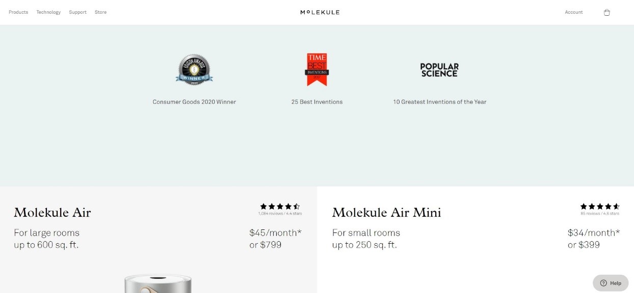
It does not matter if the brand is an “honest one.” The customers might think otherwise, and rightfully so, unless you bring in social proofs like awards, customer reviews, and press mentions to win their attention.
But do not add it all at one time. Some rookie companies tend to bombard their website with all kinds of social evidence, and it comes off as a bit self-righteous and stuck-up. Make the important ones your main priority by putting yourself in the customer’s shoes and thinking about what they might want to know about your product first hand.
Summing it up
Undoubtedly, everybody loves a beautiful website. The UI should have an emotional as well as visual impact on the visitors. However, your business’s success does not depend on beauty alone, but how much the domain can help customers find what they need. That is the real purpose of any logo design valley and rebranding techniques mentioned in this piece.
Author Bio
Erica Silva
Erica Silva is a blogger who loves to discover and explore the world around her. She writes on everything from marketing to technology. She enjoys sharing her discoveries and experiences with readers and believes her blogs can make the world a better place.
Find her on Twitter: @ericadsilva1


