To deliver a powerful presentation, you need two things: persuasive words and exciting visuals. Moreover, it is essential that they both team up to tell your story.
But what if we were to tell you that your visuals matter more than your words? Don’t believe us? We have got science to back ourselves:
According to the content marketing institute – 90% of the information that reaches the brain is visual, which means that our brains prefer visuals over spoken words. Also, we remember 80% of what we see, 20% of what we read, and 10% of what we hear.
This means that visuals are certainly the most important factor of a presentation because they aid long-term retention and help you deliver impactful and engaging presentations. Let us now understand how you can use visuals to your advantage and deliver powerful presentations.
How Visuals Can Help You Deliver Powerful Presentations
Substitute Text with Graphics
Survey your presentation and try to get rid of text wherever possible. Stay away from verbose slides and bullet points. Think of PowerPoint as a graphical tool and substitute text with visuals like icons, charts & graphs, infographics, etc.
If you are using bullet points, use no more than 4 on a slide where each point has no more than 5-6 words. Bullet points should be used as prompts, and the explanation must be left to the spoken words. Too much text can distract the audience away from you.
Choose Your Fonts Wisely
Readability always comes first. Choose a font that can be easily read and understood. You need a font that has tall lowercase letters that are not squished together. Letters must have ample space between them. Verdana and Georgia are the best fonts for PowerPoint presentations as they are not overused and rank high on readability.
Know Your Colors
Colors and emotions are inextricably linked. Colors can spark a variety of emotions, depending on the type of shades and hues used. To choose the best color for your PowerPoint presentation, you must learn about the different color palette schemes. They are:
Monochromatic, Analogous, Complementary, Split, Complementary, and Triadic. Check out this blog on building visually effective PowerPoint slides based on vision science principles.
Use Professional PowerPoint Templates
Designing a presentation with strong and captivating visuals from scratch can be extremely time-consuming. You can spend hours still not achieving the perfect result, or maybe you do, but is it worth it when you spend hours doing it?
The quickest way of framing a visually appealing and impactful presentation is to use professional PowerPoint templates designed to give you the best looking visuals without the hassle of designing them yourself.
Presentation templates at SlideUpLift are designed by professionals who understand vision science principles and business needs to create effective business PowerPoint templates. These templates ensure that you don’t have to worry about the visual aspects but only about your presentation’s content.
So, do give PowerPoint templates a try. SlideUpLift offers a wide collection of Free PowerPoint Templates to get you started.
Shapes Matter
Shapes are great influencers of the mind and can have an immense impact on how we feel about an idea. We automatically relate to shapes as they give a basis to the physical world.
There are several shapes that you can use to improve your presentations’ visual appeal:
- Triangles
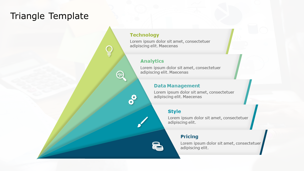
We relate triangles to mountains, and a mountain can signify a difficult task/goal that can be achieved by reaching the peak. The triangle base represents the capacity to execute the task, the sides signify the journey, and the peak represents the task/goal itself.
Triangles are great for representing – company goals & mission, problem-solving processes, or highlighting key strategic initiatives.
- Squares and Rectangles
These shapes are omnipresent, and we see them everywhere in the form of doors, computers, buildings, etc. We relate to them because they look secure, balanced, and simple.
When used properly, these shapes can do wonders by providing a sense of structure and flow to your presentation.
- Circles
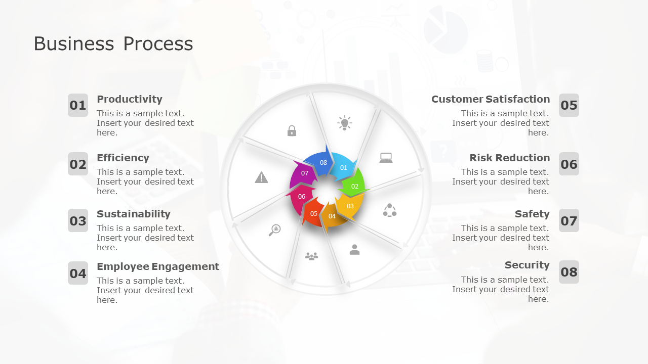
A circle can work wonders to bring the whole slide together and instill a calm and relaxed feeling. Circles are great in helping the viewer focus on the main point of interest, thereby increasing audience engagement. Circles can be used for highlighting – a business process, continuity, or interconnection/strategy.
- Lines
Lines may seem dull and uninteresting, but they can be extremely helpful in improving the slide’s overall appearance. Lines provide structure and give the slide a proper definition. For example, a content-stuffed slide can be made comprehensible by drawing lines and making sections. Multiple horizontal lines can make the slide appear bigger/wider, and multiple vertical lines can make it appear taller.


